✦ Selected collection

Selected Campaigns & Additional Work

The depth behind the current work: channel identity, agency campaigns for established brands, and the print craft underneath it all.

Additional work projects

Selected — Full Channel Branding & On-Air Creative

YA TV

Full channel branding and on-air identity for a broadcast network: one system carried through the complete visual language surrounding its programmes.

Logo & IdentityOn-Air PackageMotion DesignWeather VisualsShow Packages

My role — Creative Director

Case Study →

360 Campaigns

Tomoca

Christmas

TVC · 360

Father Christmas takes his Kabba off — and the country is asked to put it back on.

Read the case

The challenge — To create a Christmas commercial that would bring the brand back into conversation, and make a TVC socially relevant enough to spread through social media.

The approach — The reveal of Father Christmas. The tale goes that behind the cloak — the Kabba — lies a weapon, used to ward off dangers met on a journey of peace. We showed the Kabba now off, a callback to the war going on in the country, and called for all Father Christmases to put their Kabbas back on and shield their weapons.

The direction — We made the call to make the Kabba the turning point, not seasonal decoration, so the Christmas story could carry a message specific to the moment in Ethiopia.

Watch on YouTubeInstagram
Malta Guinness

Enjoy a World of Good

TVC · 360

A chain of kindness that loops back on itself, and never stops.

Read the case

The challenge — To follow the yearly global Sharing the Goodness campaign — calm, emotional, about caring and giving — and merge it with the ongoing WezWez campaign, which is fast, energetic and built on dancing.

The approach — Energetically paying it forward: showing that what you pay forward inevitably comes back to you. The TVC follows a chain of strangers helping each other in daily random acts of kindness, and the chain never stops — it loops every time. On the BTL front the campaign ran a sales-based donation system, giving 10 cents per custom-labelled bottle sold to a hospital.

The direction — We made the call to join the emotional global brief and the energy of WezWez through one looping act of kindness, then give that idea a tangible role through the donation mechanic.

Watch on YouTube

Digital Campaigns

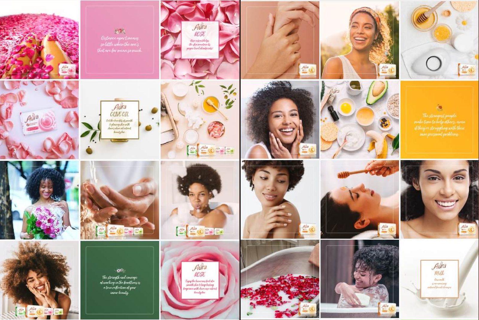
Aura social campaign grid

54 Capital

Aura

Digital Campaign

A digital campaign built to reach 60% of young Ethiopian women through natural beauty.

Read the case

The challenge — How to reach at least 60% of young Ethiopian women on digital to promote natural beauty through Aura.

The approach — A digital campaign focused on the natural ingredients the product is made of, providing a go-to channel for remedies, tips and support — including Covid Quotes — for the all-natural woman.

The direction — We made the call to make the channel useful before making it promotional, letting ingredients, remedies and timely support carry the brand promise.

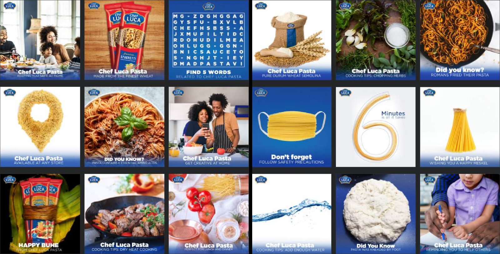
Chef Luca social campaign grid

54 Capital

Chef Luca

Digital Campaign

A year-long arc from awareness to cooking with kids.

Read the case

The challenge — To create a digital brand presence that resonates with the target demographic and presents Chef Luca as the premium yet affordable pasta brand.

The approach — An evolving campaign transcending over a year: beginning with brand awareness, evolving into the go-to source for locally relevant, Amharic-centred recipes, then into pasta and general cooking tips and cooking with kids.

The direction — We made the call to let the content mature with the audience—from recognition to recipes to shared cooking—rather than repeat one launch message for a year.

Print & Graphic Design

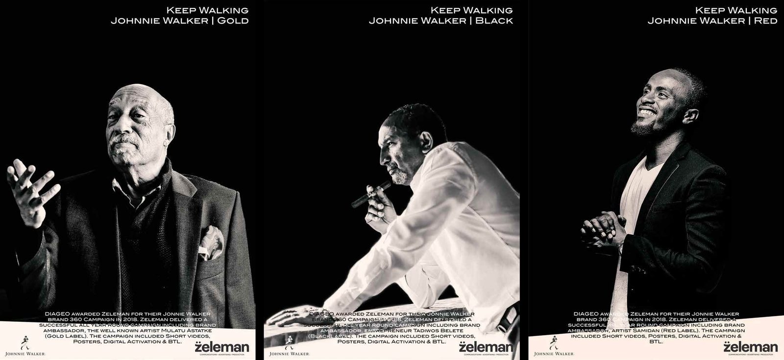
Johnnie Walker print key visual
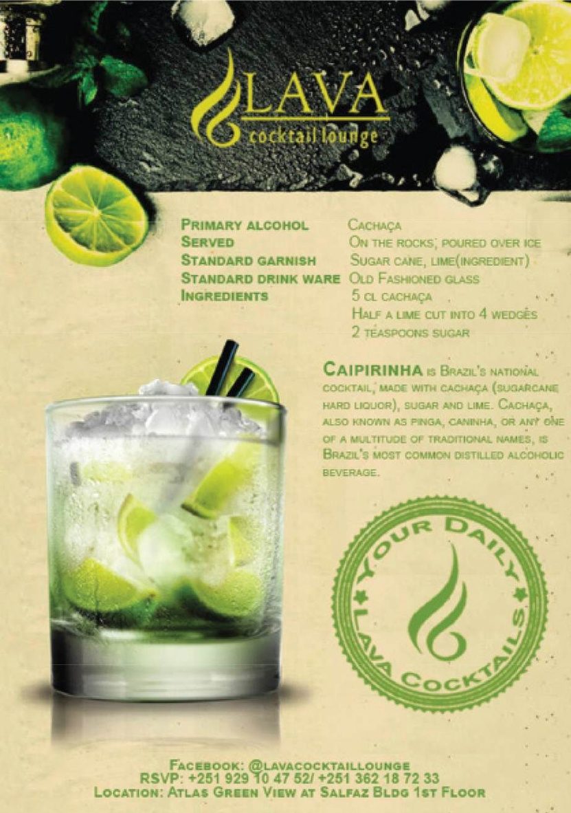
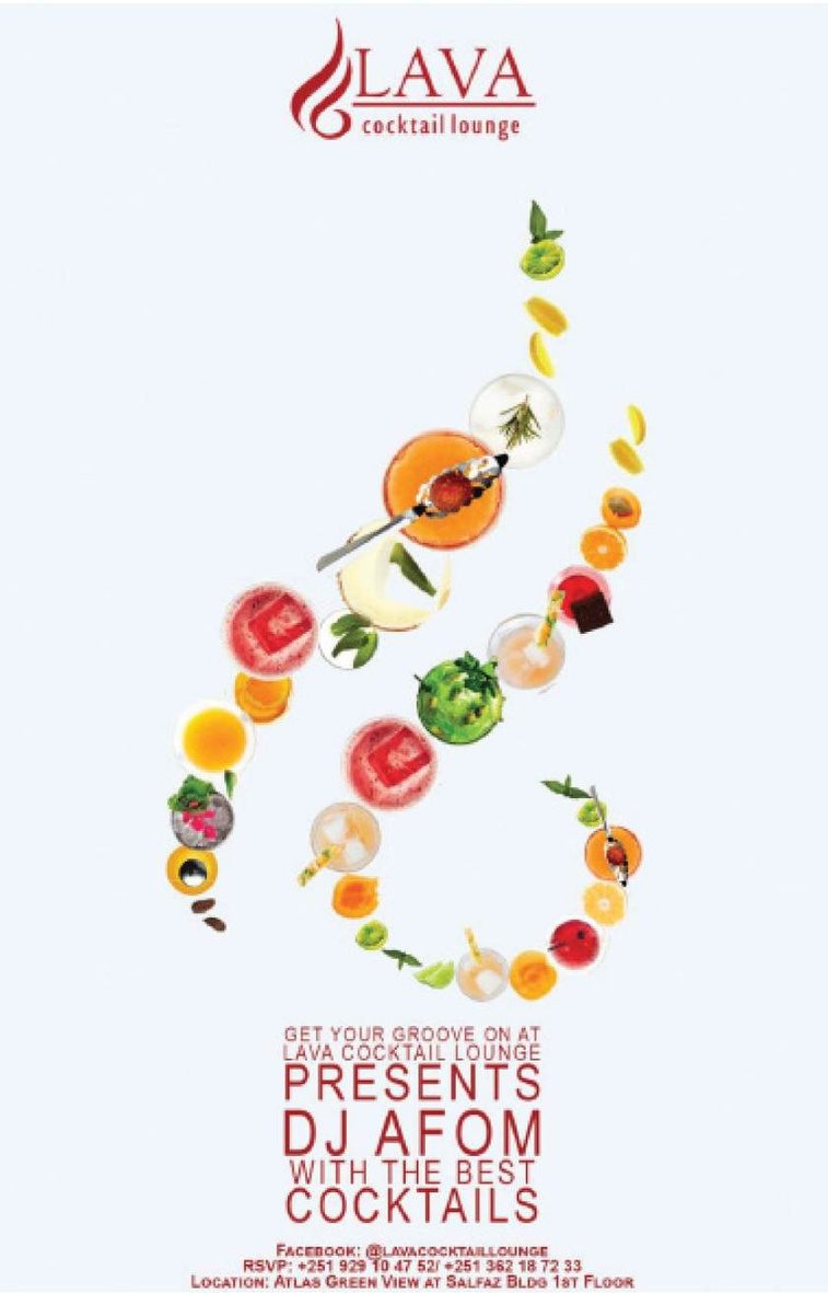
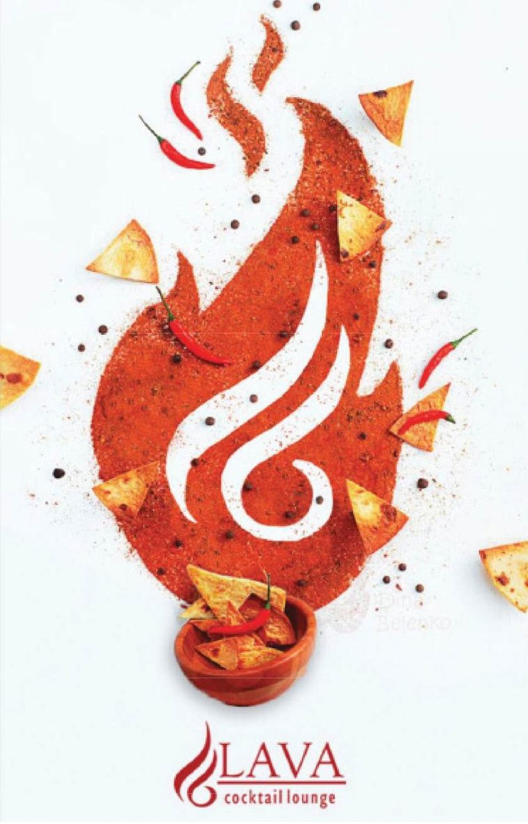
Lava cocktail key visualLava eight-year key visualLava flame key visual

Johnnie Walker · Lava

Nightlife Print & Key Visuals

Print · Key Visual

Bottles, flames and eight-year statements built for club walls.

Read the case

The challenge — To make bar and nightlife communication that still reads at a glance in a dark, crowded room.

The approach — High-contrast product photography and heavy type, art directed so the bottle and the single line of copy carry the whole frame — cocktail menus, flame visuals and the eight-year lockup.

The direction — We made the call to strip each frame to one product and one line, protecting legibility in the dark rather than adding more information to compete with the room.

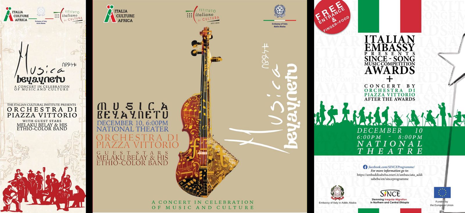
Concert poster series

Events & Culture

Concert Posters

Poster Design

Line-ups, dates and one image doing all the shouting.

Read the case

The challenge — To sell out shows with a single poster in a feed and on a wall.

The approach — A poster series where scale and type hierarchy do the work: artist first, everything else in strict order underneath.

The direction — We made the call to let hierarchy do the shouting—artist first, details second—so the posters work at feed speed and from across a room.